

用plot3绘制空间曲线(用Plotly绘制了几张精湛的图表)
用plot3绘制空间曲线(用Plotly绘制了几张精湛的图表)
作者:俊欣
来源:关于数据分析与可视化
说到Python当中的可视化模块,相信大家用的比较多的还是matplotlib、seaborn等模块,今天小编来尝试用Plotly模块为大家绘制可视化图表,和前两者相比,用Plotly模块会指出来的可视化图表有着很强的交互性。
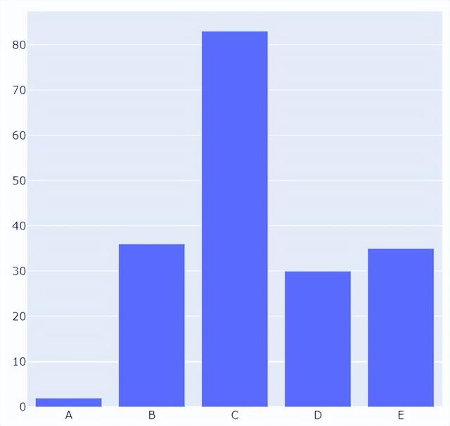
柱状图
我们先导入后面需要用到的模块并且生成一批假数据,
import numpy as np import plotly.graph_objects as go # create dummy data vals = np.ceil(100 * np.random.rand(5)).astype(int) keys = ["A", "B", "C", "D", "E"]
我们基于所生成的假数据来绘制柱状图,代码如下
fig = go.Figure() fig.add_trace( go.Bar(x=keys, y=vals) ) fig.update_layout(height=600, width=600) fig.show()
output
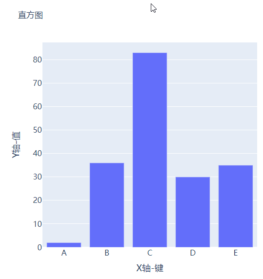
可能读者会感觉到绘制出来的图表略显简单,我们再来完善一下,添加上标题和注解,代码如下
# create figure fig = go.Figure() # 绘制图表 fig.add_trace( go.Bar(x=keys, y=vals, hovertemplate="Key: %{x}
Value: %{y}
") ) # 更新完善图表 fig.update_layout( font_family="Averta", hoverlabel_font_family="Averta", title_text="直方图", xaxis_title_text="X轴-键", xaxis_title_font_size=18, xaxis_tickfont_size=16, yaxis_title_text="Y轴-值", yaxis_title_font_size=18, yaxis_tickfont_size=16, hoverlabel_font_size=16, height=600, width=600 ) fig.show()
output
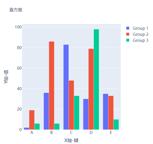
分组条形图和堆积条形图
例如我们有多组数据想要绘制成柱状图的话,我们先来创建好数据集
vals_2 = np.ceil(100 * np.random.rand(5)).astype(int) vals_3 = np.ceil(100 * np.random.rand(5)).astype(int) vals_array = [vals, vals_2, vals_3]
然后我们遍历获取列表中的数值并且绘制成条形图,代码如下
# 生成画布 fig = go.Figure() # 绘制图表 for i, vals in enumerate(vals_array): fig.add_trace( go.Bar(x=keys, y=vals, name=f"Group {i 1}", hovertemplate=f"Group {i 1}
Key: %{{x}}
Value: %{{y}}
") ) # 完善图表 fig.update_layout( barmode="group", ...... ) fig.show()
output
而我们想要变成堆积状的条形图,只需要修改代码中的一处即可,将fig.update_layout(barmode="group")修改成fig.update_layout(barmode="group")即可,我们来看一下出来的样子
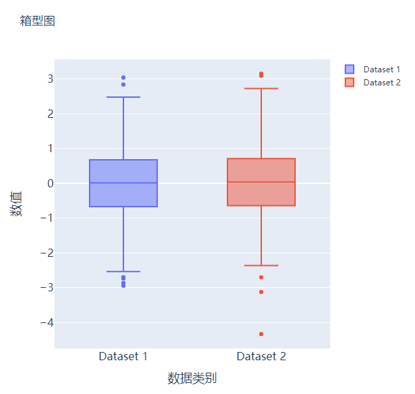
箱型图
箱型图在数据统计分析当中也是应用相当广泛的,我们先来创建两个假数据
# create dummy data for boxplots y1 = np.random.normal(size=1000) y2 = np.random.normal(size=1000)
我们将上面生成的数据绘制成箱型图,代码如下
# 生成画布 fig = go.Figure() # 绘制图表 fig.add_trace( go.Box(y=y1, name="Dataset 1"), ) fig.add_trace( go.Box(y=y2, name="Dataset 2"), ) fig.update_layout( ...... ) fig.show()
output
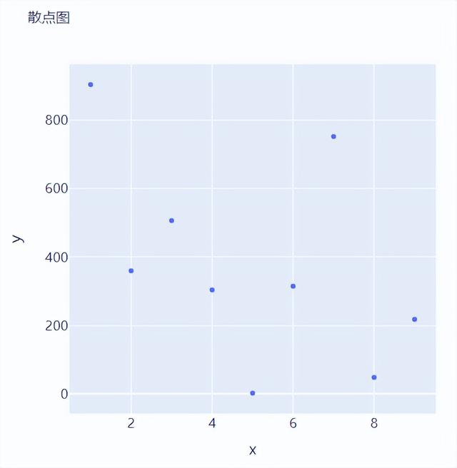
散点图和气泡图
接下来我们尝试来绘制一张散点图,也是一样的步骤,我们想尝试生成一些假数据,代码如下
x = [i for i in range(1, 10)] y = np.ceil(1000 * np.random.rand(10)).astype(int)
然后我们来绘制散点图,调用的是Scatter()方法,代码如下
# create figure fig = go.Figure() fig.add_trace( go.Scatter(x=x, y=y, mode="markers", hovertemplate="x: %{x}
y: %{y}
") ) fig.update_layout( ....... ) fig.show()
output
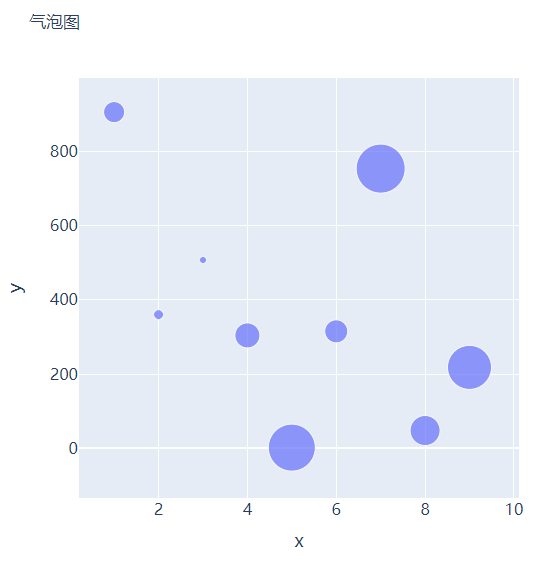
那么气泡图的话就是在散点图的基础上,根据数值的大小来设定散点的大小,我们再来创建一些假数据用来设定散点的大小,代码如下
s = np.ceil(30 * np.random.rand(5)).astype(int)
我们将上面用作绘制散点图的代码稍作修改,通过marker_size参数来设定散点的大小,如下所示
fig = go.Figure() fig.add_trace( go.Scatter(x=x, y=y, mode="markers", marker_size=s, text=s, hovertemplate="x: %{x}
y: %{y}
Size: %{text}
") ) fig.update_layout( ...... ) fig.show()
output
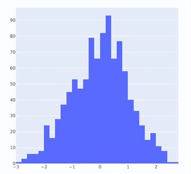
直方图
直方图相比较于上面提到的几种图表,总体上来说会稍微有点丑,但是通过直方图,读者可以更加直观地感受到数据的分布,我们先来创建一组假数据,代码如下
## 创建假数据 data = np.random.normal(size=1000)
然后我们来绘制直方图,调用的是Histogram()方法,代码如下
# 创建画布 fig = go.Figure() # 绘制图表 fig.add_trace( go.Histogram(x=data, hovertemplate="Bin Edges: %{x}
Count: %{y}
") ) fig.update_layout( height=600, width=600 ) fig.show()
output
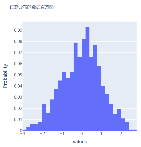
我们再在上述图表的基础之上再进行进一步的格式优化,代码如下
# 生成画布 fig = go.Figure() # 绘制图表 fig.add_trace( go.Histogram(x=data, histnorm="probability", hovertemplate="Bin Edges: %{x}
Count: %{y}
") ) fig.update_layout( ...... ) fig.show()
output
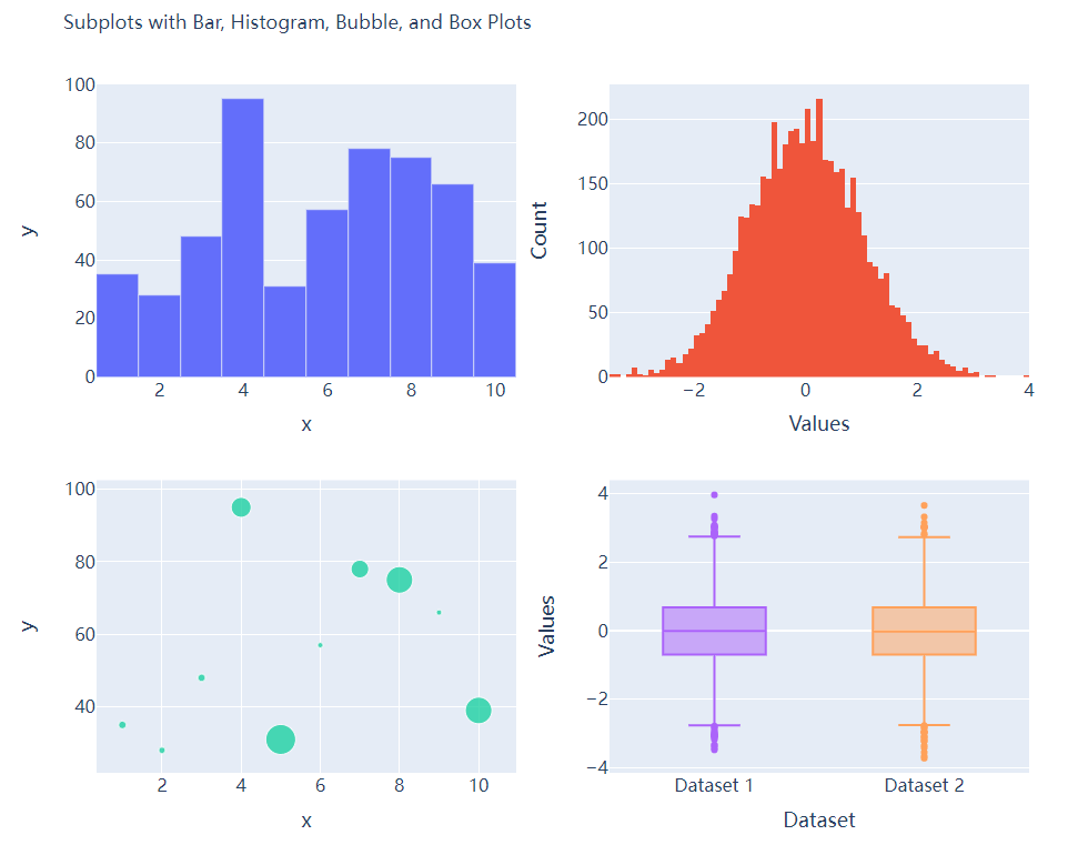
多个子图拼凑到一块儿
相信大家都知道在matplotlib模块当中的subplots()方法可以将多个子图拼凑到一块儿,那么同样地在plotly当中也可以同样地将多个子图拼凑到一块儿,调用的是plotly模块当中make_subplots函数
from plotly.subplots import make_subplots ## 2行2列的图表 fig = make_subplots(rows=2, cols=2) ## 生成一批假数据用于图表的绘制 x = [i for i in range(1, 11)] y = np.ceil(100 * np.random.rand(10)).astype(int) s = np.ceil(30 * np.random.rand(10)).astype(int) y1 = np.random.normal(size=5000) y2 = np.random.normal(size=5000)
接下来我们将所要绘制的图表添加到add_trace()方法当中,代码如下
# 绘制图表 fig.add_trace( go.Bar(x=x, y=y, hovertemplate="x: %{x}
y: %{y}
"), row=1, col=1 ) fig.add_trace( go.Histogram(x=y1, hovertemplate="Bin Edges: %{x}
Count: %{y}
"), row=1, col=2 ) fig.add_trace( go.Scatter(x=x, y=y, mode="markers", marker_size=s, text=s, hovertemplate="x: %{x}
y: %{y}
Size: %{text}
"), row=2, col=1 ) fig.add_trace( go.Box(y=y1, name="Dataset 1"), row=2, col=2 ) fig.add_trace( go.Box(y=y2, name="Dataset 2"), row=2, col=2 ) fig.update_xaxes(title_font_size=18, tickfont_size=16) fig.update_yaxes(title_font_size=18, tickfont_size=16) fig.update_layout( ...... ) fig.show()
output
CDA数据分析师分享案例,欢迎大家留言分享你的建议。
,
-

- 优衣库是哪个国家的牌子(为何国人抢购的日本品牌优衣库)
-
2023-07-27 04:17:13
-

- 尤文图斯c罗3:0马竞(C罗双响破荒科斯塔吐口水染红)
-
2023-07-27 04:15:07
-

- 立冬的句子短句唯美,描写立冬的优美段落
-
2023-07-27 03:03:38
-

- 表白的情书怎么写,深情的告白文案
-
2023-07-27 03:01:34
-

- 教师节诗句赞美老师简短(赞美老师的经典古诗词)
-
2023-07-27 02:59:29
-

- 雪景感悟短句有哪些,下雪的文案发朋友圈
-
2023-07-27 02:57:24
-

- 给B点赞某UP(给B点赞某UP)
-
2023-07-27 02:55:19
-

- 立冬祝福有些什么,秋日暖阳的优美短句
-
2023-07-27 02:53:14
-

- 描写清明节的古诗大全,清明节诗句经典古诗
-
2023-07-27 02:51:09
-

- 适合国庆中秋发的朋友圈(迎中秋庆国庆发朋友圈的句子)
-
2023-07-27 02:49:04
-

- 正在还房贷的房产证可以加名字吗 手续费多少
-
2023-07-27 02:47:00
-
- 李心艾不雅(李心艾被内地制作人)
-
2023-07-27 02:44:55
-

- 银纹是什么(银纹是什么样子的)
-
2023-07-26 21:17:00
-

- 雄安新区是哪里(河北雄安新区在什么地方)
-
2023-07-26 21:14:55
-

- 十六周年结婚纪念日是什么婚(结婚十六周年是什么年)
-
2023-07-26 21:12:50
-

- 青岛啤酒企业文化(青岛啤酒的企业文化是什么?)
-
2023-07-26 21:10:45
-

- 古代西亚文明起源于哪里(古代西亚文明起源于什么平原)
-
2023-07-26 21:08:41
-

- 发扬斗争精神,树立什么思维
-
2023-07-26 21:06:36
-

- 711是24小时营业吗(711是全天营业吗)
-
2023-07-26 21:04:31
-

- 什么是财富的源泉(人类财富的源泉是什么)
-
2023-07-26 21:02:26
 玄幻小说完结巅峰之作排行(2023十大完结巅峰神作)
 微量元素有多少种 查微量元素,不要想当然(健康直通车(第67站))